 (305) 834 7600
Classic Color Combos for Small Spaces
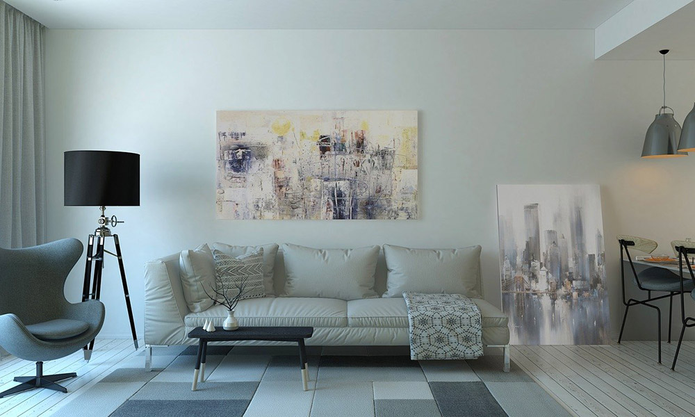
As most of us know, small space living can make everything seem somewhat crowded. Small rooms can even feel uncomfortable and confining. However, some design concepts trick the eye into making the interiors appear more spacious than they are.
While you might need creative thinking, this option helps you open up your home and make it look bigger and spacious. If you’re looking to be a resident at our Park Grove condominiums for sale, consider these color combos.
Monochromatic Schemes
If you wish to be more daring in your color options while residing at our units at Park Grove, we recommend a monochromatic scheme to maintain an orderly look. You can achieve this scheme easily by selecting shades of a similar color throughout your room. We find that this technique yields a relaxing and sophisticated look with various decorating styles.
Dark Colors
You can use dark colors successfully in a small space if you maintain a simple color palette. Powder room and dining rooms are popular options for dark colors irrespective of the room’s size. We recommend dark walls for a spectacular backdrop for artwork decoration, particularly with painted white or metallic frames.
Cool versus Warm Colors
Integrating cool colors in a small space is a popular decorating rule. In theory, we discover that warm colors advance while cool ones recede. Nevertheless, it doesn’t imply that you should use pale blue in every small room. Incorporating cool colors in a small space must be a consideration and guideline, not an ironclad rule.
If you want to include warm colors in your room, you could select light shades of the colors on your walls. Most successful palettes comprise a blend of cool and warm colors, with one color dominating. For small spaces, the warm color should be dominant, but include cool accents in the room as well.
Light colors and smart contrasts
Generally, light colors make rooms appear brighter and bigger. Bright and light walls are usually more reflective, making your space feel airy and open; this helps exploit the effect produced by natural light. On the other hand, dark colors absorb light, making our rooms appear smaller. For an optimal effect, we recommend soft tones of white, green, and blue. Remember, brighter rooms appear larger and more inviting.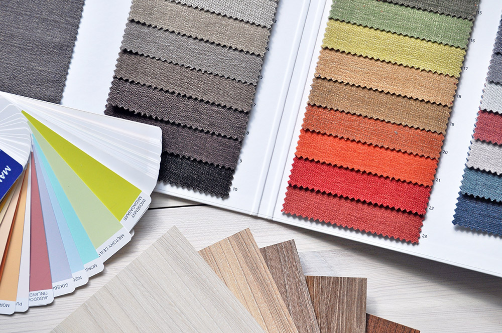
Colors to avoid for small spaces
Selecting a color for a small space isn`t merely about choosing the brightest white in the hopes of making your room appear bigger. While you aren’t restricted to light colors, you’ll want to select the right hue to capitalize on the room. You want to avoid these colors while residing at our units at Park Grove pre-construction condos for sale.
White
White might appear like the ideal color for a small space since it can enhance dark corners and reflect light. The dated notion that small rooms should only be in white has undergone replacement with an unlimited color palette.
White paint in a small space could make it appear bland and boxy. Although white paint should make a room appear bright and light, it could do the reverse when it reveals every dark corner or shadow. Nevertheless, white can be a beautiful option for a small space though it works best as a trim color or accent.
Muted Neutrals
Neutral colors are great for small spaces and while you aren´t restricted to using neutrals, we find that the appropriate neutral color could make a small room appear more spacious due to its simplicity. Don´t presume that whichever neutral color will suit your small space.
Beware that a muted neutral color will make your room appear dark and small. We recommend you integrate warm neutral hues that reflect light around your room. A strategy to make a neutral space seem more spacious is to select neutral furnishings, lines, or drapes to match the wall color.
A color you dislike
Recognizing the hues that function well in a small space is simply the beginning point of your search for the best color. Don´t select a color merely because it makes a room look bigger. A color you like might not be the best option for producing a spacious appearance, but if the color doesn´t excite you when you walk into the room, it won´t matter how large it appears.
If you have a preferred color in mind, you might need to alter the shade to match your room. However, it doesn´t mean you need to relinquish it. If there´s no way to use your favorite color, consider neutral walls with your preferred color as an accent.
The wrong undertones
When decorating a small space, every inch matters. Remember, the wrong color is harder to conceal in a small space since every wall is close regardless of where you sit or stand. Undertones separate the right from the wrong colors.
You´ll need to pay close attention to whichever color you´re considering since a neutral with an unforeseen green or pink undertone will be apparent in a small space.
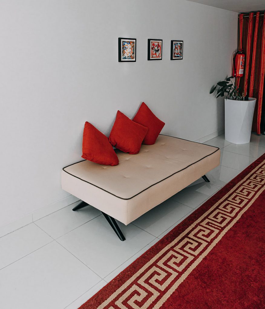 Red
Red
This color is striking and has been the go-to option for dining rooms for several years. However, this color is unsuitable for small spaces. The warmth and energy of this color can heat a small space, leaving you feeling uncomfortable and overwhelmed. We recommend you leave it as an accent color for your small space.
While small-space living comes with its set of challenges, it doesn´t mean you can´t enjoy it. If you want to make your space look bigger, these color strategies will prove invaluable.